
Walking the World: The Making of The Long Walk Home Maps
- Devni Jayakody
- Feb 20, 2025
- 3 min read

Updated: Jul 16, 2025
Step One: Realizing the Scope of the Madness
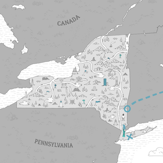
When I first got the brief for The Long Walk Home, my initial thought was, "Oh cool, a map project!" Then I saw the list: 27 illustrated country maps + one massive overall map spanning from the tropics of Sri Lanka to the icy edges of Canada. That’s when it hit me—this wasn’t just a map project; it was an artistic marathon of epic proportions.
Joel Rapp literally walked across continents, and while I wasn’t trekking the same miles, my stylus was about to do some serious heavy lifting.
Every country had to have its own vibe, but still fit in with the overall look of the project. The aim was to find a sweet spot between different elements—getting things right while keeping it artistic, having enough detail without losing clarity, and making sure it’s both fun and functional.

Step Two: Becoming a Cartographer (Sort of)
Let’s be real—cartography is a serious science, and I am, in fact, not a scientist. Each country’s illustration had to capture the essence of the places Joel had walked through—the landmarks, the energy, the quirks.
First, I dove into research mode: poring over maps, satellite images, and street photography to understand the terrain. Then came the iconography—tiny visual elements representing key landmarks, cultural symbols, or hilarious moments from Joel’s journey (spoiler: walking across the world means a LOT of weird encounters).


Step Three: The Art of Organized Chaos
With this many maps, things could have spiraled into chaos fast. So, I set some ground rules for the design:
A consistent illustration style that felt hand-drawn yet crisp.
A color palette that adapted to each region—think warm, earthy tones for India, deep blues for the Nordic crossings, and lush greens for the European countryside.
Icons that function like stamps, giving each map personality while keeping things cohesive.
Then came the landmarks, which presented an unexpected challenge: How do you make sure someone walking across a country feels connected to the most defining spots? Not every major city made the cut, but the ones that mattered to the journey did. The Taj Mahal? Definitely. A random gas station in the middle of Kazakhstan? Surprisingly, yes.


Step Four: Finding the Fun in the Details
One of my favorite parts? Sneaking in little Easter eggs. Every now and then, I’d hear a hilarious or bizarre story from Joel’s walk and find a way to illustrate it subtly into the map. Maybe it was a landmark where something ridiculous happened, or a tiny icon of a tent to mark an unexpectedly rough camping night. If you look closely, you might find some inside jokes hidden in the illustrations.
And let’s talk about the overall map—a grand visual summary of the entire walk. This beast had to seamlessly weave together all 27 countries while still looking cohesive. The key? Flow. Just like Joel’s “Be the River” philosophy, the map had to guide the eye smoothly from one region to the next, letting viewers follow the path as if they were walking it themselves.
Step Five: Wrapping It Up
By the end, my brain was filled with way too many geographic facts, my drawing tablet had survived an absolute workout, and I had a whole new appreciation for the sheer madness of walking across the planet.
Illustrating The Long Walk Home wasn’t just about making maps—it was about visualizing a once-in-a-lifetime adventure, helping to tell a story through lines, shapes, and color. I may not have walked across the world, but for a little while, I got to see it through Joel’s footsteps. And that? Totally worth it.


Comments